Reading Response:
In the article, “Why Mood Boards Matter,” it says “A picture is worth a thousand words, and mood boards are a great tool to create that picture for your client.” This is very accurate. Mood boards portray what you are thinking about making the site/project look like for the client and it is the easiest way to communicate that to them so that they are on the same page with you. This is good so that you can know what they want and then get it done a lot faster rather than taking even longer on discussing what the client wants.
In the book Don’t Make Me Think (Revisited), by Steve Krug, he states in the first chapter that you literally do not want the user to think. It is all about their needs and making the site or app as easy to navigate as possible. I think this is very important when working with a client. Everything should be self explanatory and all “question marks” should be eliminated. In the second chapter Krug talks about how not everyone uses/ reads a webpage the same which is true, but we actually scan the site first. And if you go to a site, knowing what you need to get to, then you don’t need to look through the rest. This is when usability testing is key. It is needed to ensure any website or app is easily navigated through.
Inspirations:
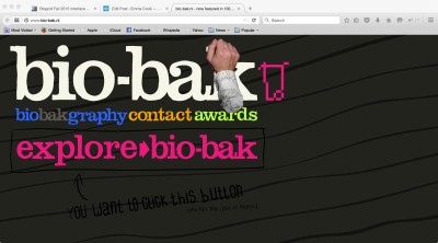
Bio-Bak
This site is one of the best I have viewed. It is a portfolio site made to be interactive for the viewer/client. The cursor is a hand and you can pick up things and click on buttons he has made specifically for all of his pages within his site. There are also little blurbs that tell you where to click or what to click next which can be helpful. The layout is kind of chaotic and overwhelming, but it gets the clients attention and gets them involved in looking at his work. His work is blow up bigger than the screen so you have to navigate around it. It is all placed on one page, which he made into a game where you have to find certain tools to put back into his tool box. It is by far the most creative and you can tell he put a lot of work into it.
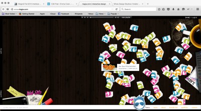
Nisgia
This site is for a media designer. His work can be seen by clicking on the little tabs that fall from the top of the screen when you go to the page. At the bottom is a nav bar to go to the about page and etc. It is fun and playful and interactive in which you can click on all the little tabs to view his work. Also when you hover over them it tells you what they are and they are color coordinated to different categories. There is also background music that you can turn on and off and switch songs at the top of the page.
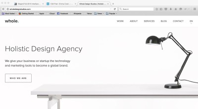
Whole Design Studios
http://wholedesignstudios.com/
This site is for a web design firm and I really gain inspiration from its simplicity. The other sites went above and beyond to grab attention, while whole keeps it simple and makes it straight to the point for clients. The nav bar is at the top with pages like about and contact and on the home page there is a button you click to learn about who they are. You can also change the language in the nav bar up top which might be handy for some clients. The font is simple along with the colors. It is easy to read and navigate through.


Leave a comment